

Coms Pro
Introduction
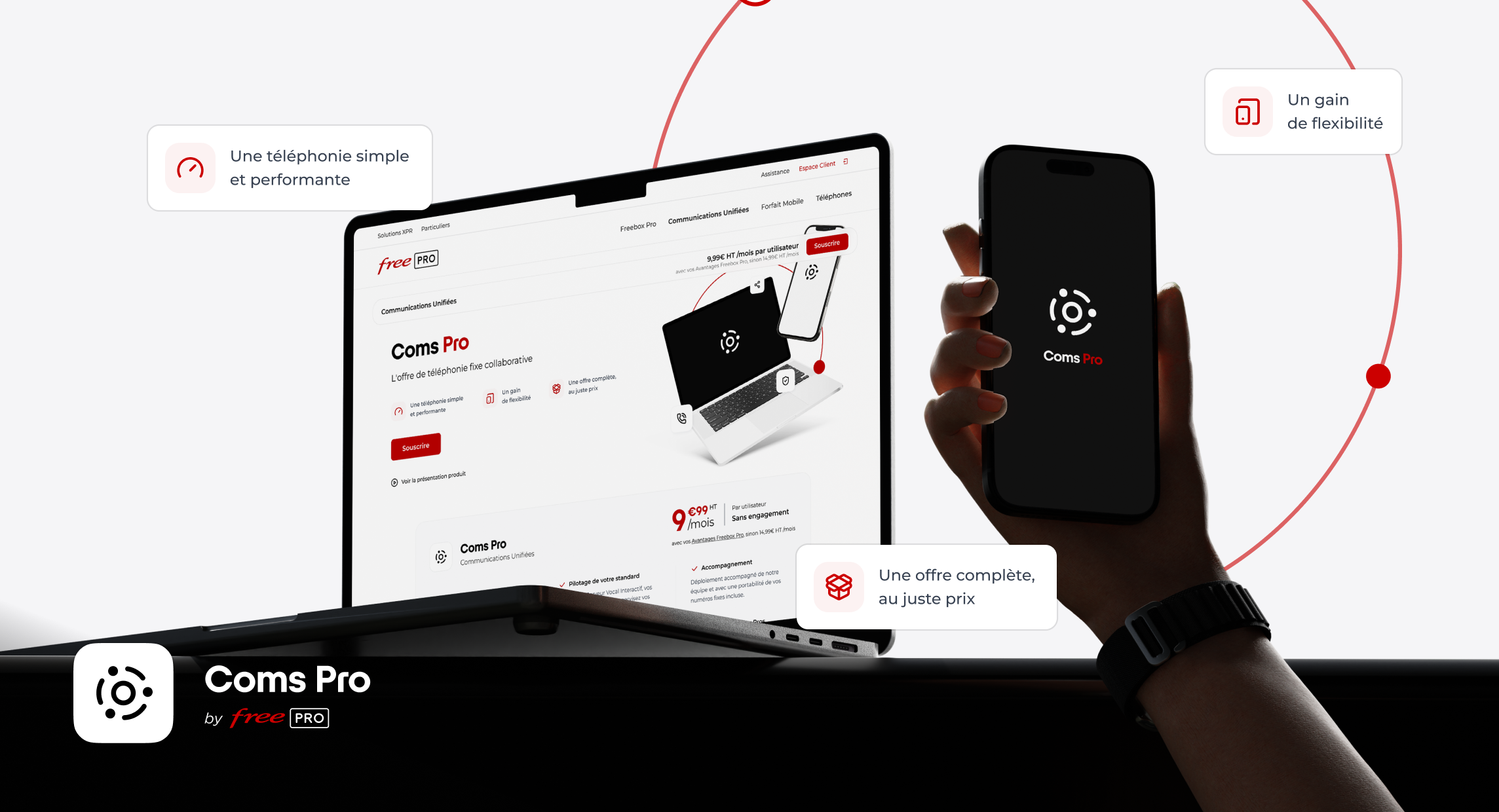
Coms Pro is Free Pro's softphone (UCaaS) solution, launched in 2024.
Available on desktop and mobile, the app brings calling, video conferencing, messaging, and file sharing together in one place, along with advanced features like an interactive voice response (IVR) system.
For this launch, I was in charge of designing the offer's visual identity and its product page for Free Pro's online store.
My role: Logo design for Coms Pro and product page design for Free Pro's online store.
Challenge & Business Context
The challenge was to turn a feature-rich offer (calling, video, collaboration, mobility…) into a single, clear symbol,
without multiplying visual codes, so the brand stays easy to read as a whole.
The logo had to work alongside the Free Pro logo, since Free Pro remains the parent brand behind the offer, andfit into a range that is consistent with the other offers (Freebox Pro, Pro Mobile Plans).
Deliverables
- Logo
- Product page
- Ad banners
- Launch visuals
Approach
For the logo, I worked in line with Free Pro's existing iconography, aiming to distill the offer's key ideas into a single mark: telephony, collaboration, mobility, and the idea of a centralized, secure platform.
The goal was a symbol that is easy to recognize and can coexist with the parent brand.
The logo design focused on distilling several key ideas into a single mark: telephony, collaboration, mobility, and the concept of a centralized, secure platform.
1. Unified
The circle symbolizes unification.
2. Mobile
3. Network
Two circles evoke sound waves spreading outward.
4. Collaborative
Three arcs representing handsets facing each other.
5. Secure
An outer circle representing a private, secure environment.
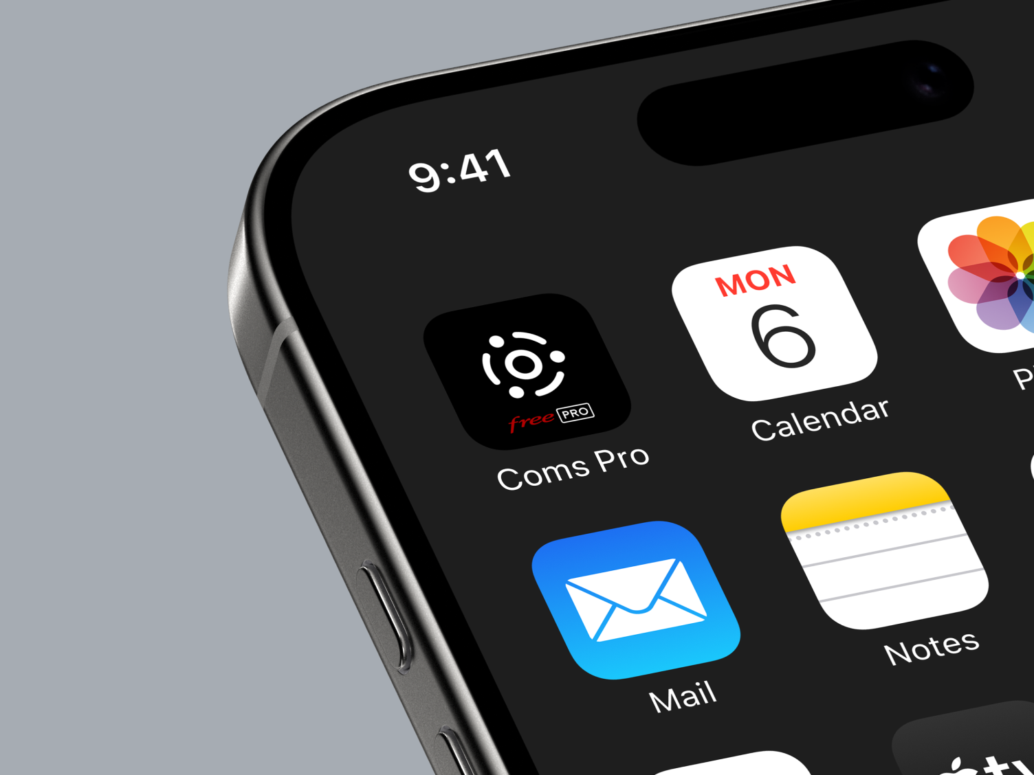
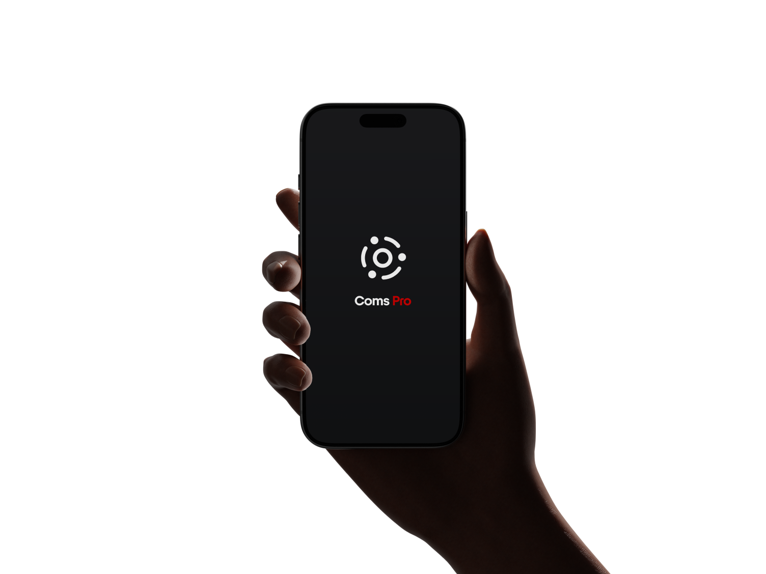
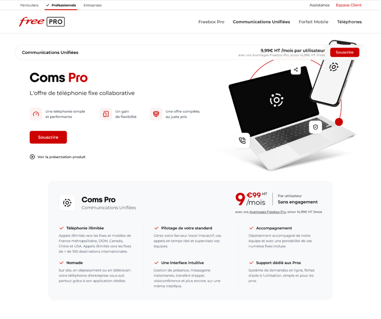
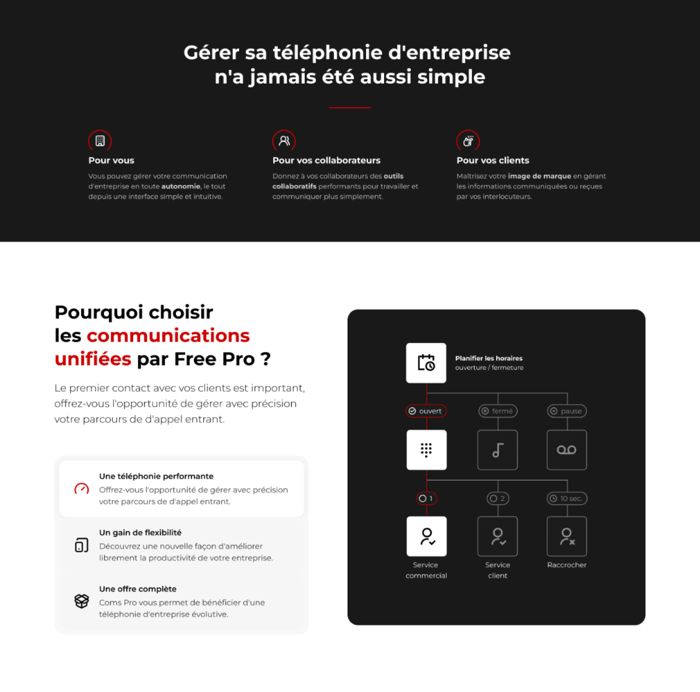
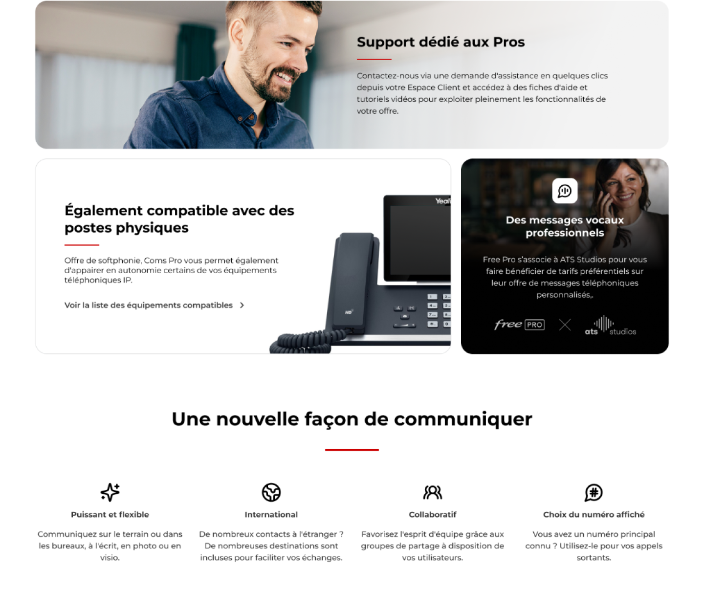
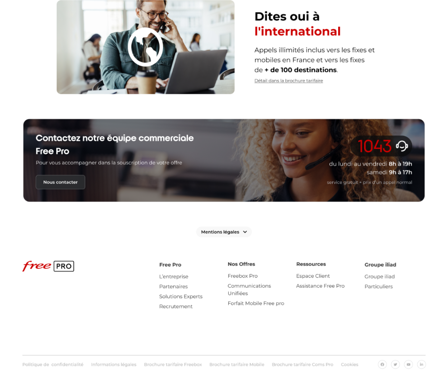
This identity was then applied to the product page on the Free Pro website.
The idea was to structure the information so it highlights the benefits small business customers look for (productivity, collaboration, accessibility).
Results
The new logo fits naturally into the existing product range without creating a visual break, while remaining easy to recognize.
The product page gives a clear view of the offer, highlighting its benefits and making a initially complex product easier to understand.
Coms Pro now has an identity that is consistent with the Free Pro brand, designed to support the offer's commercial launch.