

Horizon XPR
Introduction
Following the success of its first edition, Horizon XPR needed a visual identity built to last.
Horizon XPR is an annual event organized by Free Pro for large enterprise clients and prospects, bringing together around 200 people for talks and exchanges between clients and technical partners.
I was in charge of designing the branding for this event dedicated to large enterprise clients and prospects.
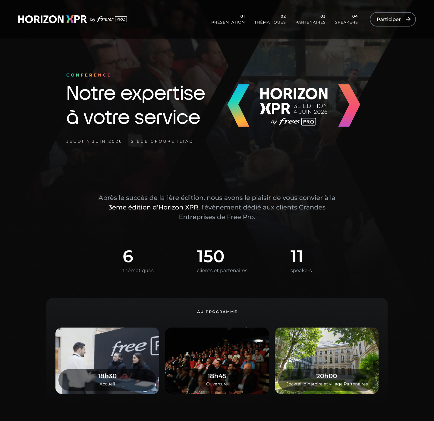
My role: Designing the event's visual identity (logo, brand guidelines) and adapting it across key materials (landing page, print materials, keynote)
Deliverables
- Brand guidelines
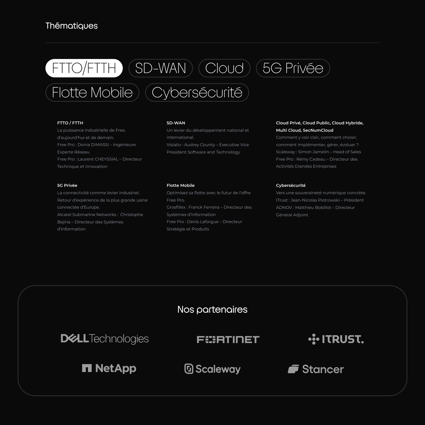
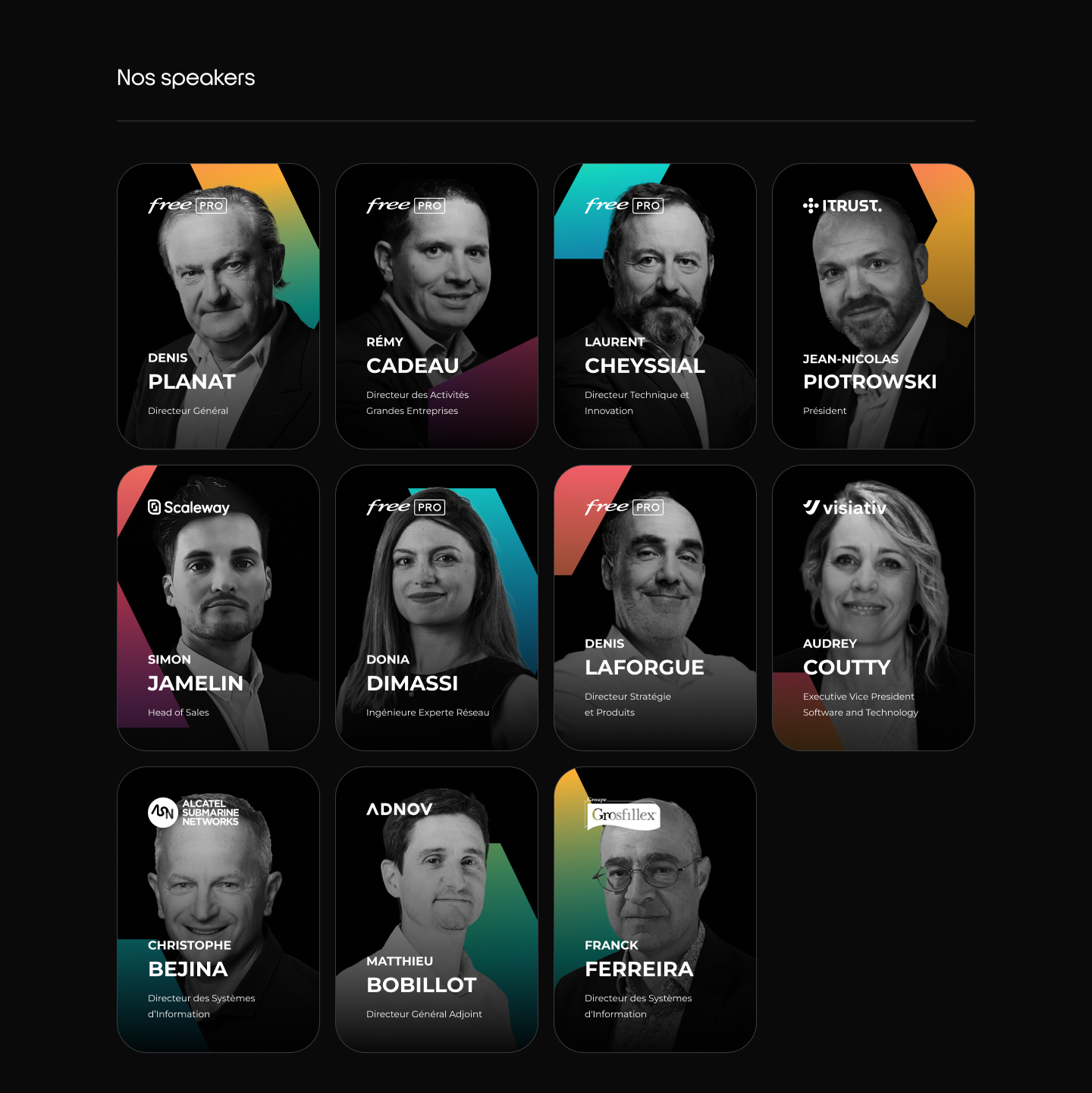
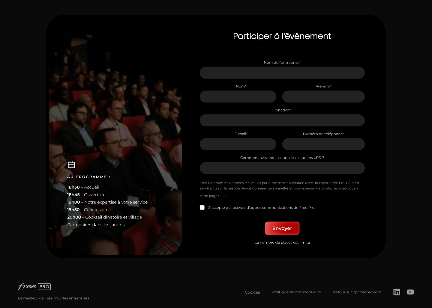
- Website
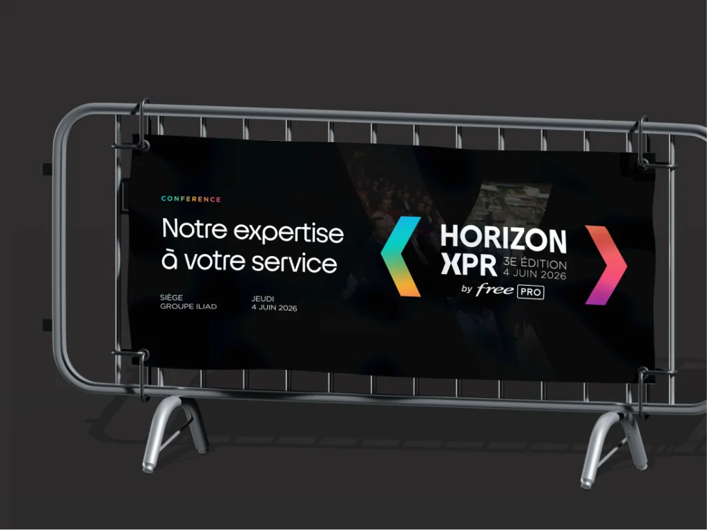
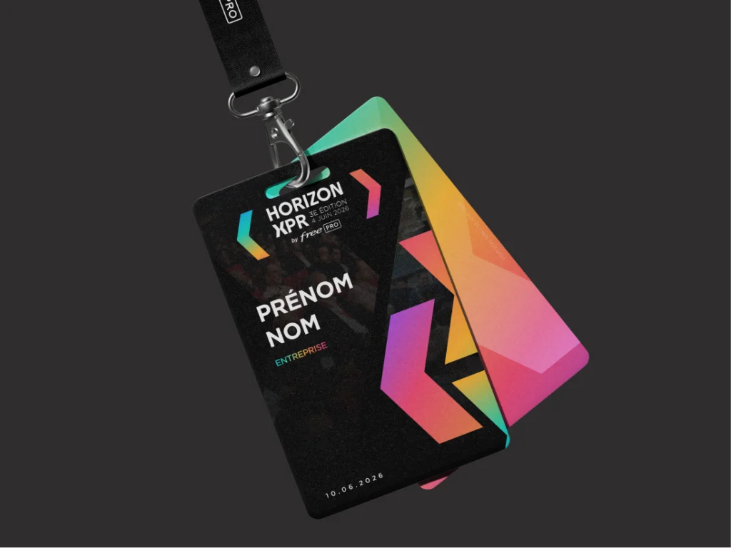
- Print (badges, roll-up banners...)
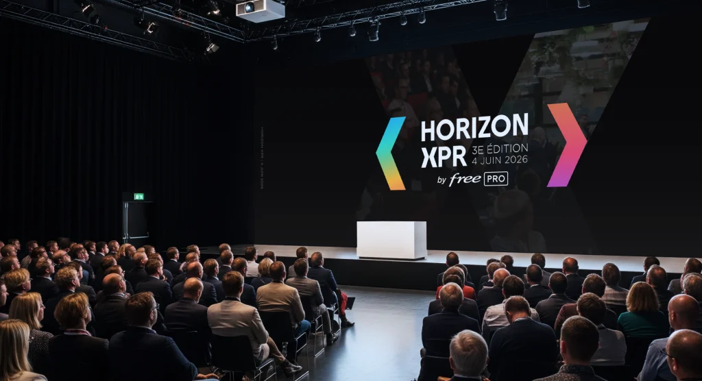
- Keynote template
- Social media visuals
Approach
The challenge was to create a strong, lasting identity rooted in the Free Pro universe.
I drew on the graphic codes of the Solutions XPR to create a link between the Solutions XPR and the event associated with them.
The concept is built around a single central element: the chevron.
Used in different forms, it evokes a quotation mark, tying into speaking, exchanges, and testimonials, the core building blocks of the event.
This graphic system was designed to be easily recognizable and to work across different formats (digital, motion, print).
Results
The project gave the event a clear, cohesive, and memorable identity, in line with the Free Pro/Solutions XPR brand.
This identity was rolled out across all of the event's communication materials and carried over to the following edition, proof of its robustness and its ability to evolve over time..