



Solutions XPR
Introduction
This project aimed to rethink the identity of Jaguar Network's products to align them with the new Free Pro brand, while preserving the technical expertise that gives Jaguar Network its credibility with its business audience.
My role: Lead Product Designer, working closely with the Key Accounts operational marketing manager. Owned the project end-to-end (branding, design system, UX/UI design, front-end integration)
Problem and Business Challenges
The acquisition by the iliad (Free) group led to the creation of offerings aimed at small and medium-sized businesses, called Offres Pro.
At the same time, Jaguar Network continued to offer technical, complex, and custom-built solutions for mid-sized companies and key accounts.
The challenge was to integrate these complex solutions into the Free universe, making them more accessible without weakening the perception of expertise or diluting their DNA, in order to reach a broader audience, from non-technical decision-makers to expert profiles (CIOs, CTOs, IT experts...).
The goal wasn't to reduce the complexity of the solutions, but to make them easier to understand by using design as a tool for clarity..
Deliverables
- Brand guidelines
- Design system
- Website
- Roll-up banner
- Social media visuals
- Ad banners
- Illustrations
Approach
The creation of the Free Pro Solutions XPR brand (pronounced "Solutions Expert"), along with the definition of its three pillars (Accessible, Modular, Fair Pricing), was led by the marketing team.
This project was structured around several key stages, with stakeholder validation at each milestone. This approach allowed the team to move forward with clarity and adjust continuously.
Competitor benchmarking, audit of the existing setup, and identification of friction points to lay the groundwork for a visual language suited to the challenges.
Creation of logos, color codes, and other brand guideline elements (photo guidelines, illustrations, icons...) for each Solutions XPR.
Setting up the site architecture (sitemap) and building wireframes to structure the pages and define the templates to be integrated.
Designing a design system based on the branding elements and producing mockups from the wireframes.
Integrating the mockups into a CMS (WordPress / Elementor) and supporting the teams in getting up to speed with the tool.
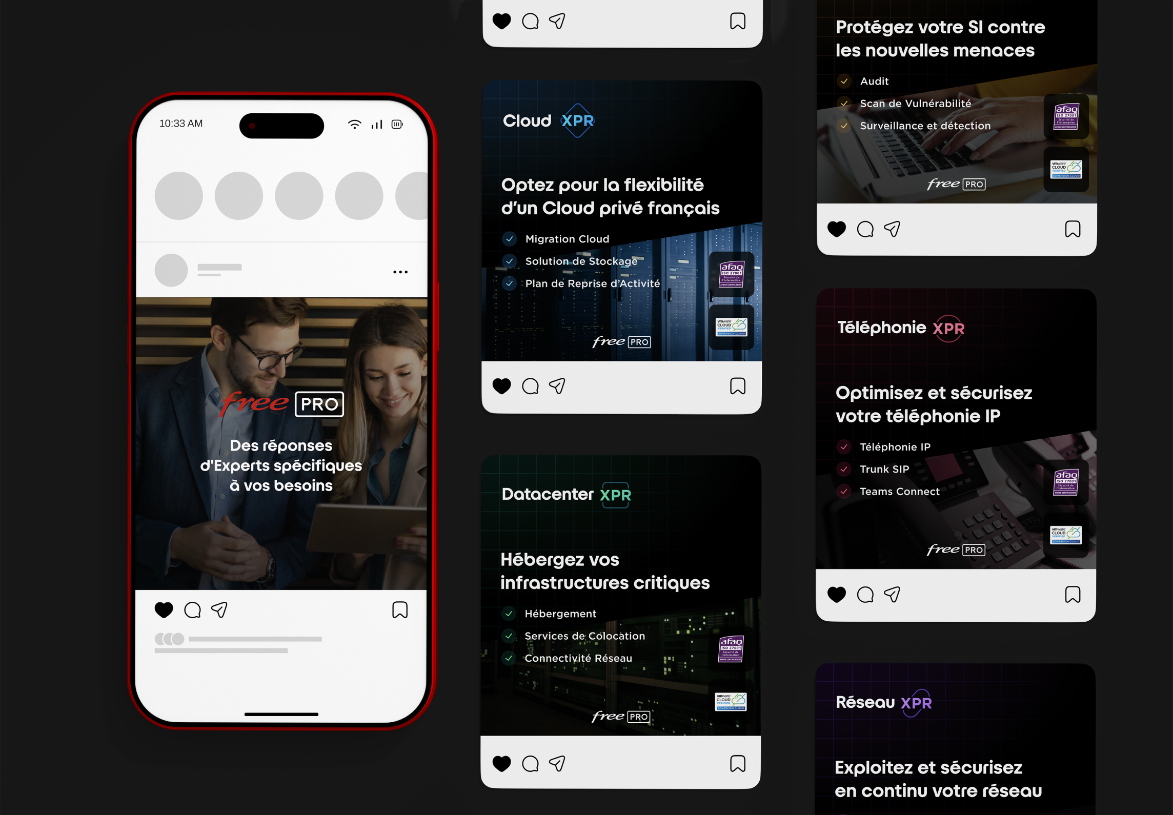
Creating visuals for social media as well as to support ad campaigns (LinkedIn, Google, Meta).
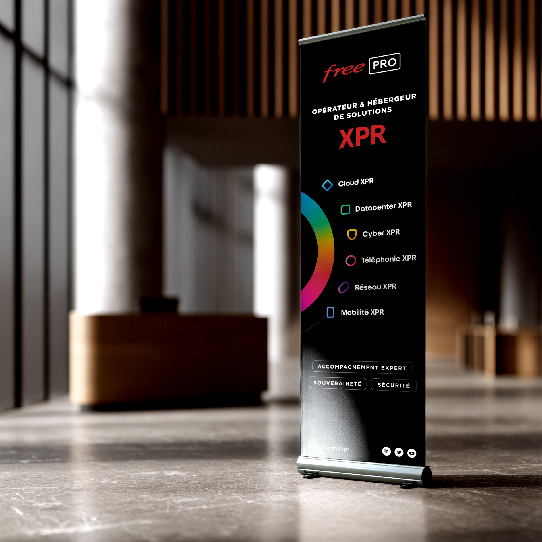
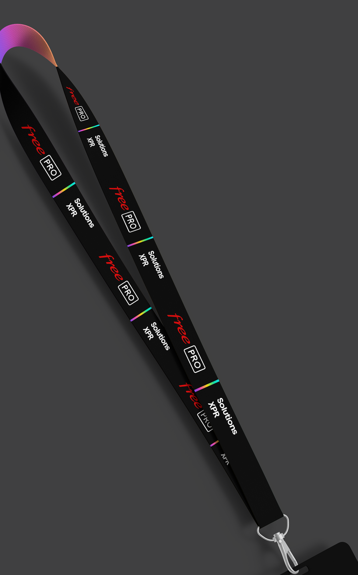
Creating printed visuals to accompany the Solutions XPR rebrand (roll-up banners, flyers, stands, etc.)
Based on feedback from sales teams and clients: interfaces and visuals were adjusted to optimize conversion.
Before starting on the branding, we conducted a benchmark of the main competitors to understand how they represented their products and structured their interfaces.
Then, an audit of Jaguar Network's existing setup helped identify the main issues: multiple identities, highly technical messaging, and a lack of hierarchy between offerings.
The goal was to create a visual language capable of giving an immediate, clear read on the solutions on offer, within a coherent, recognizable, and scalable universe..






Branding
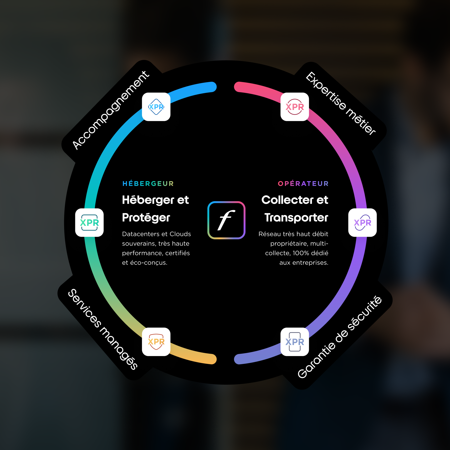
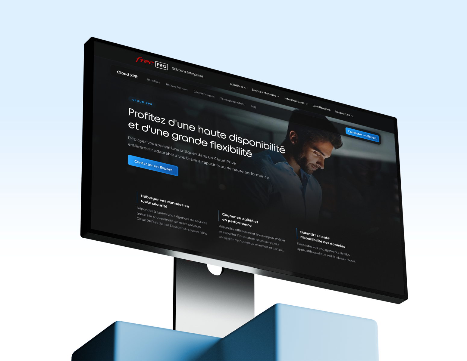
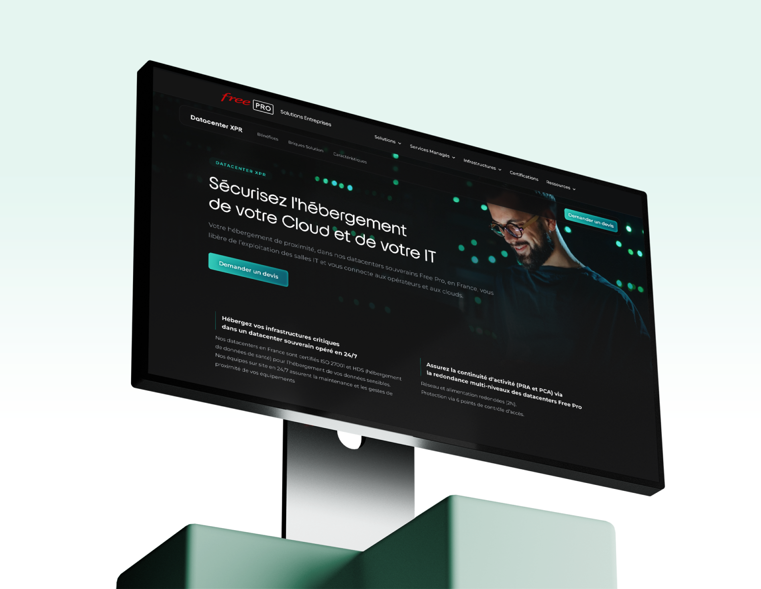
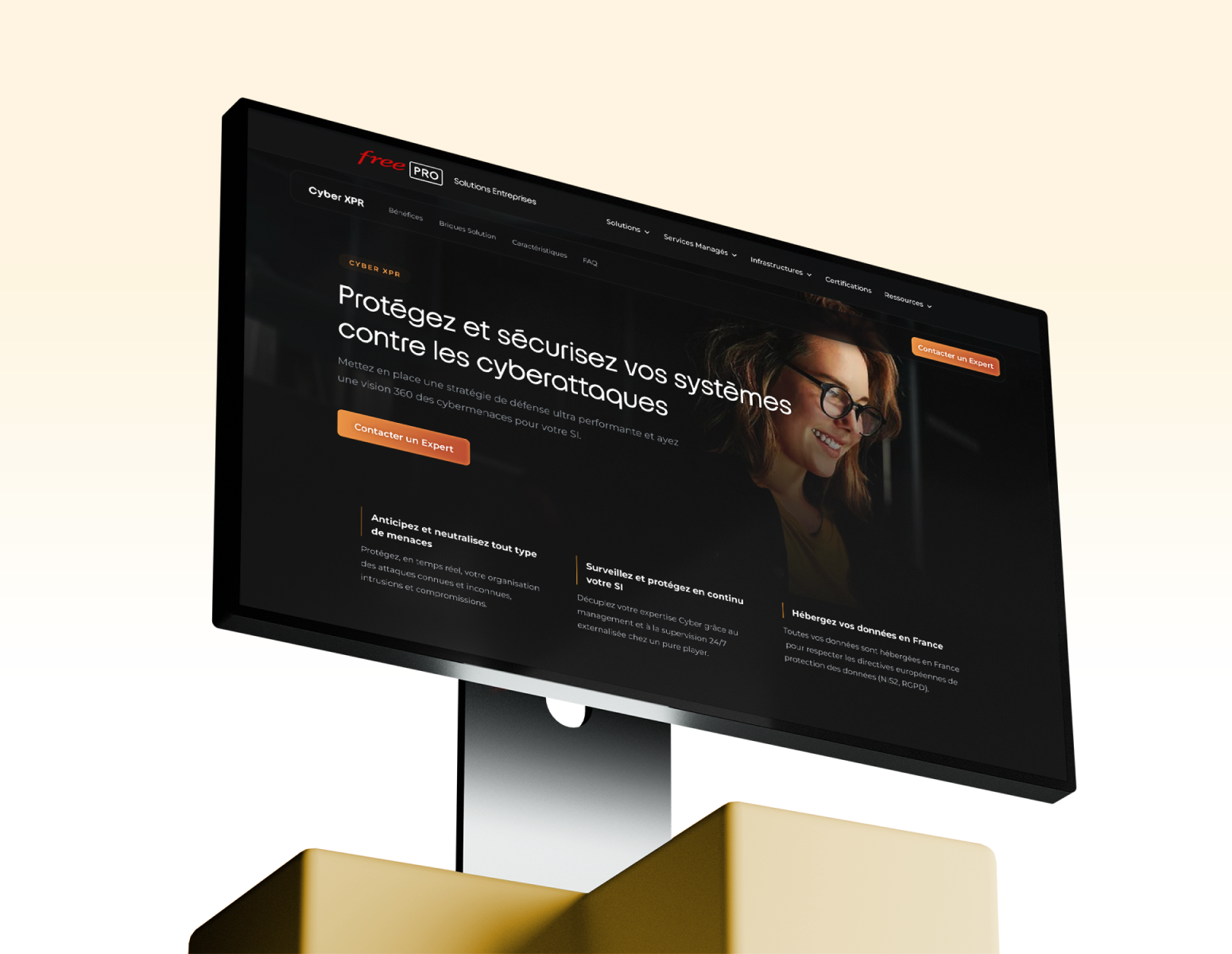
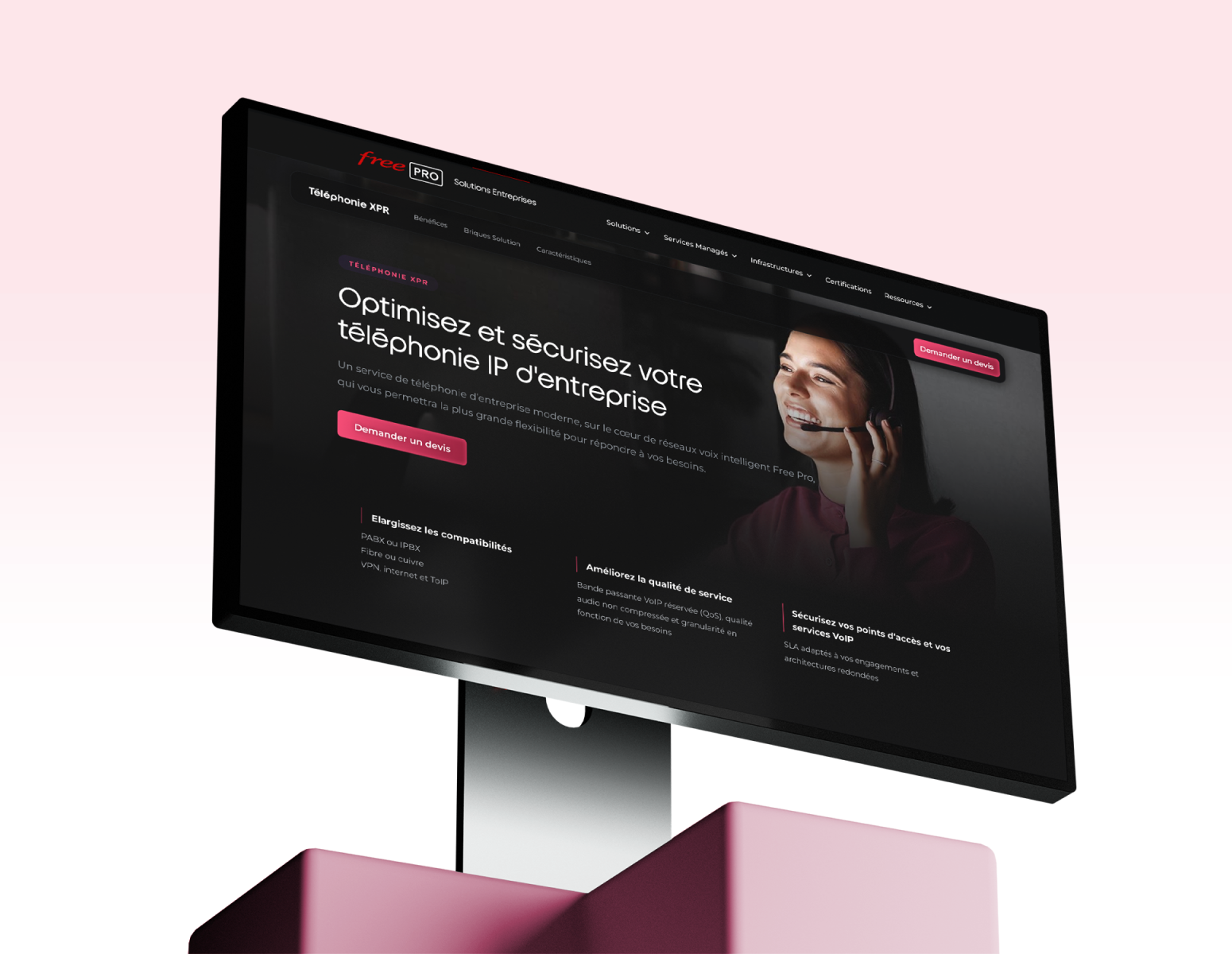
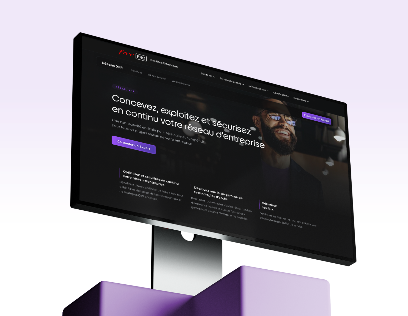
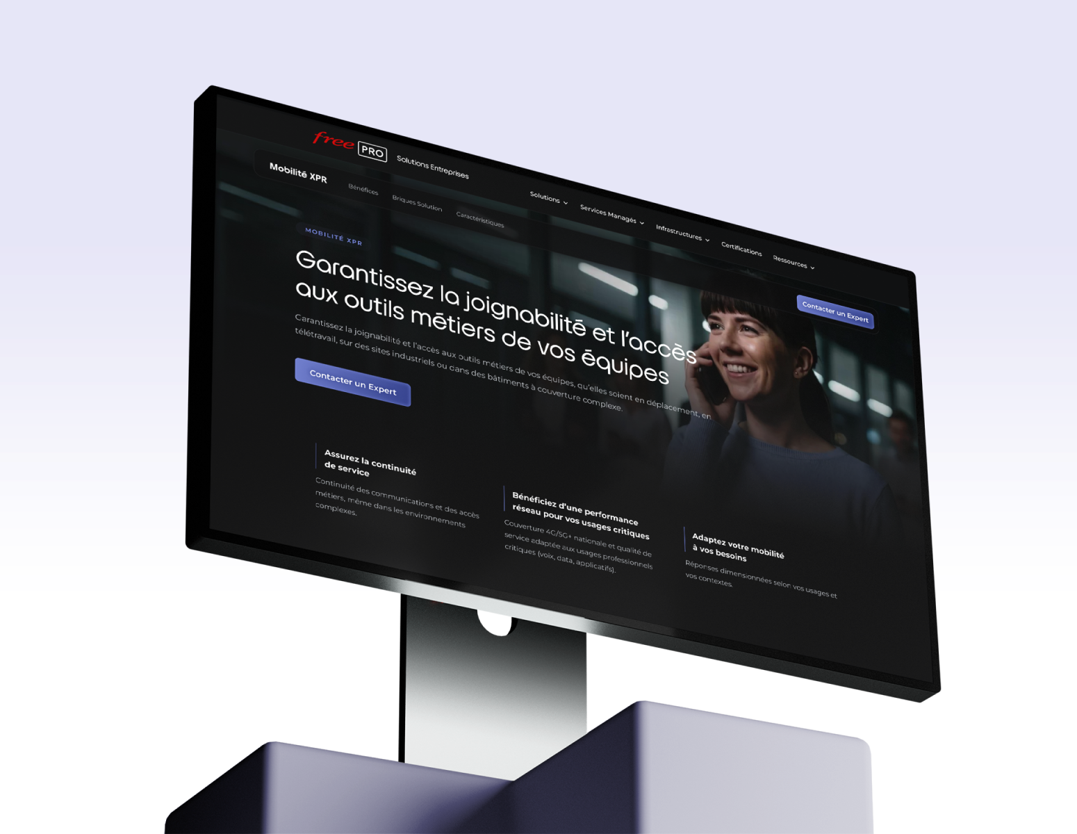
I designed a logo for each of the six Solutions XPR. Each identity fits within an overall system: a color code unique to each solution and a geometric shape that reflects the need it addresses.
UX/UI
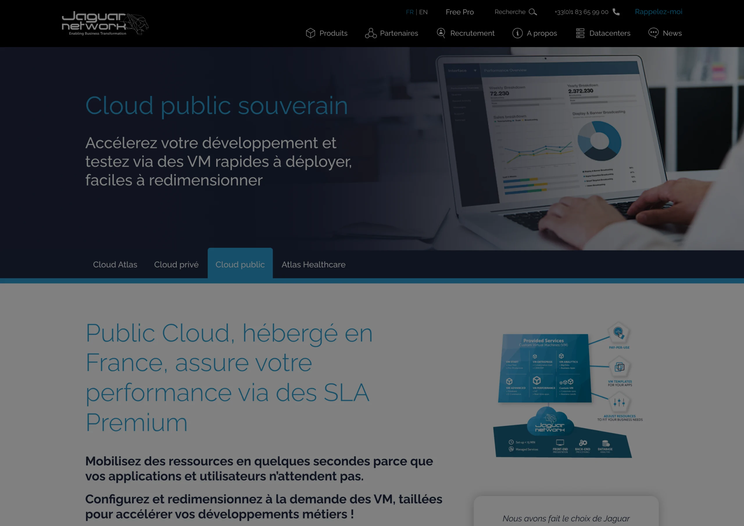
Before the redesign, the digital ecosystem was fragmented. Several sites coexisted (blog, showcase site, documentation…), each following different logic and multiple design systems. Navigation was complex and maintenance was difficult.
I integrated everything into a single CMS, designed to give greater autonomy to the marketing team.
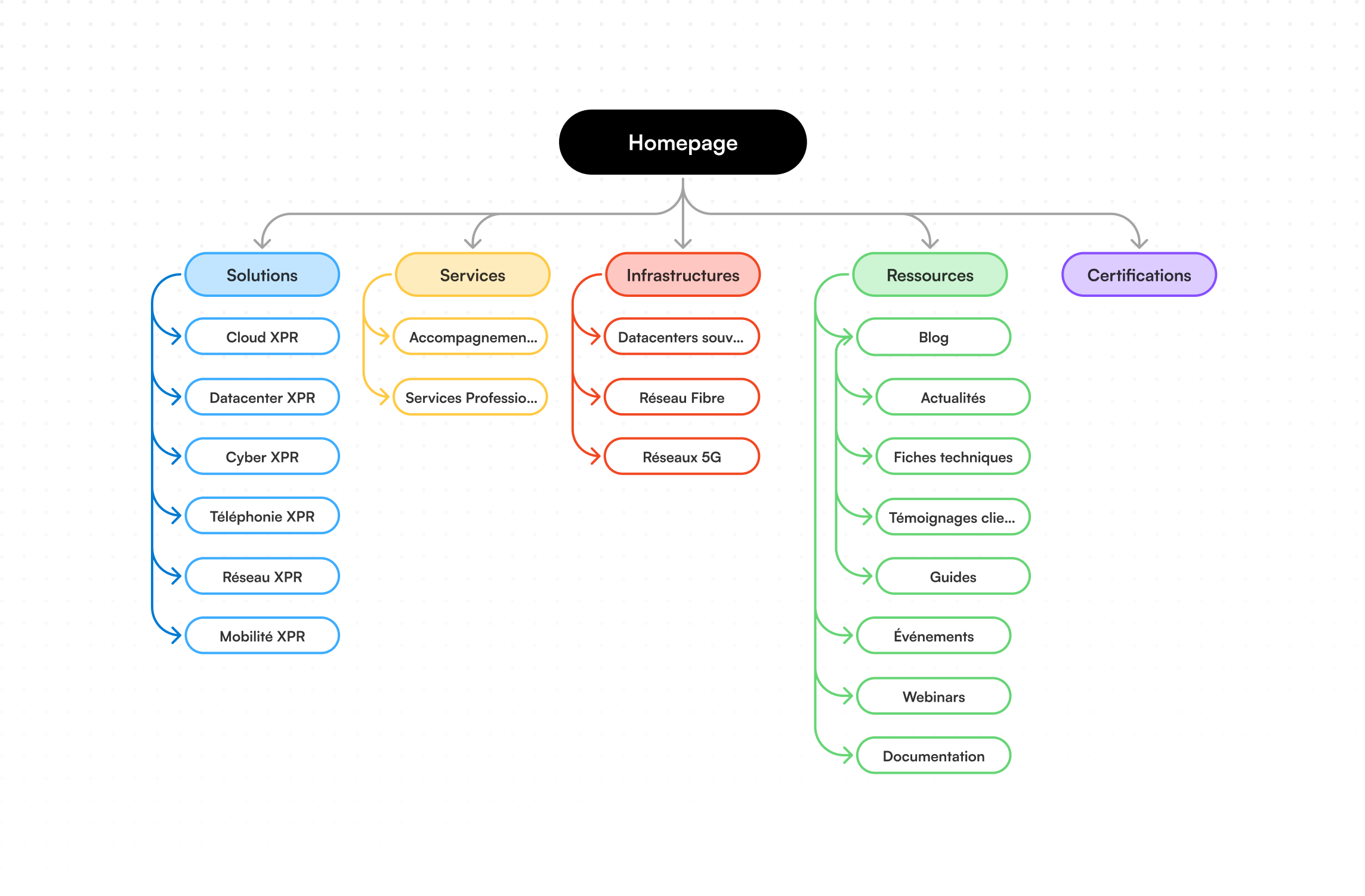
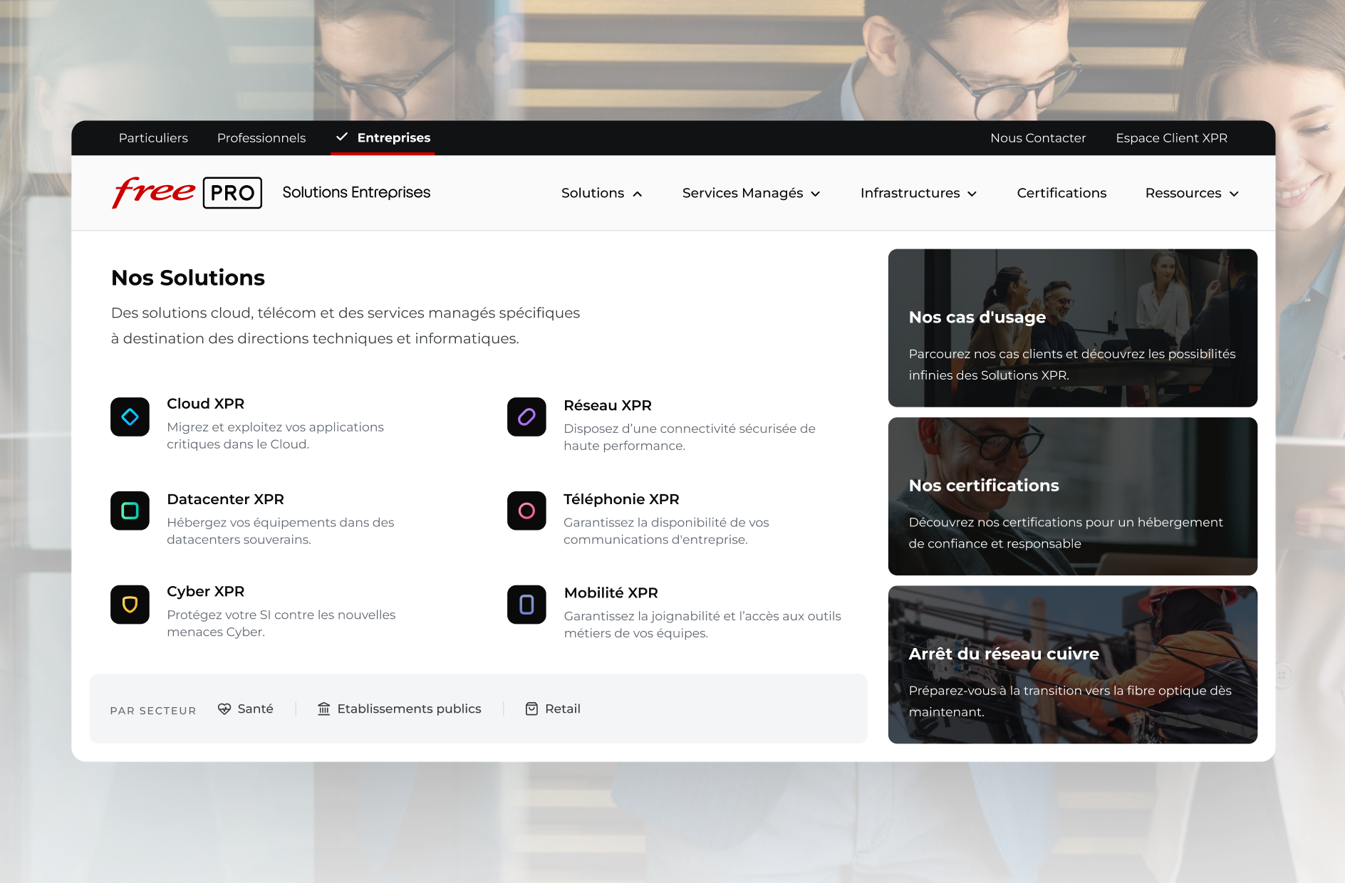
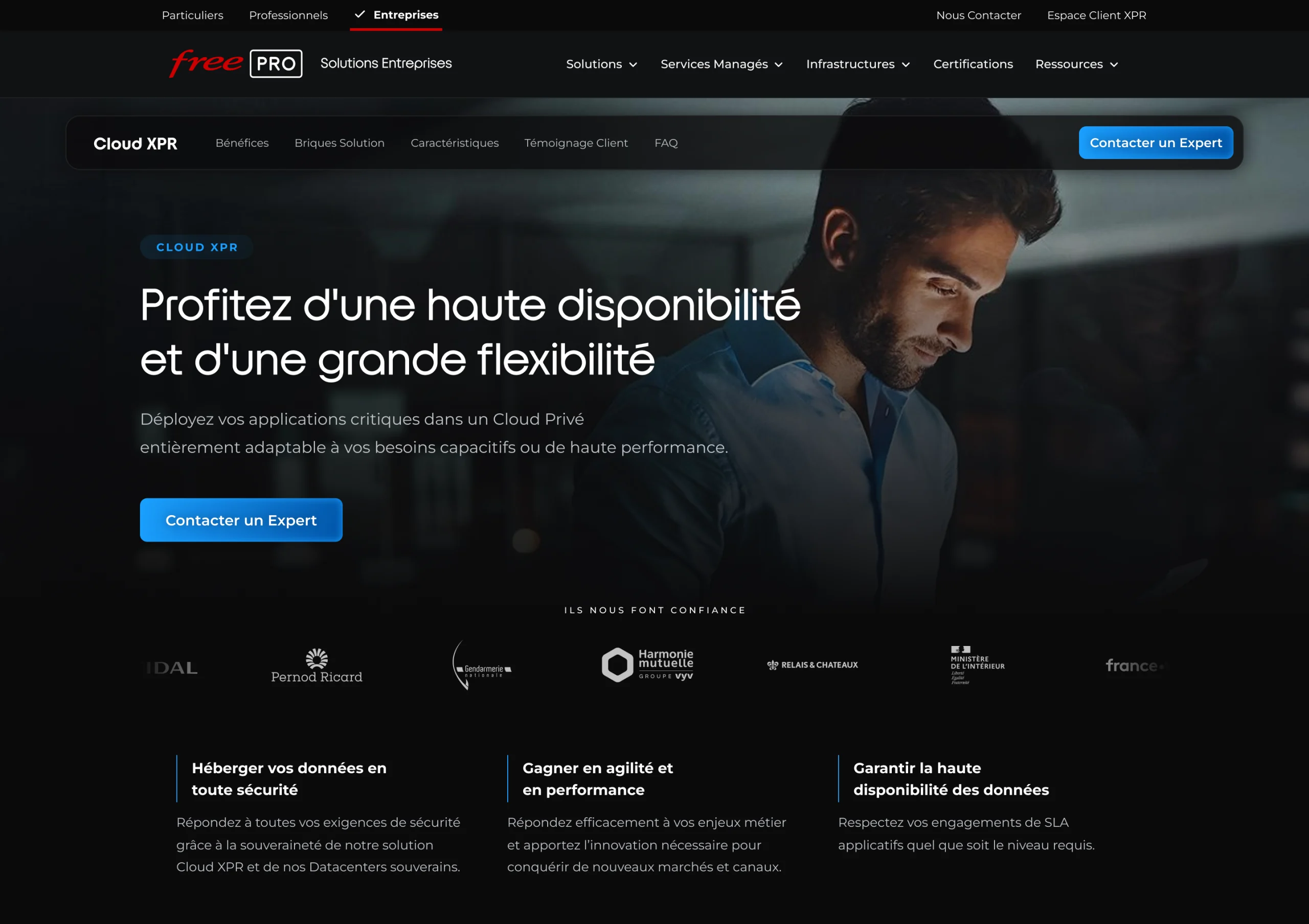
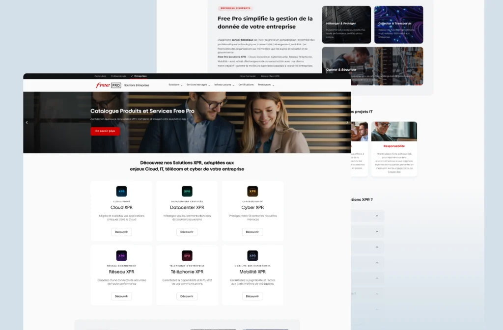
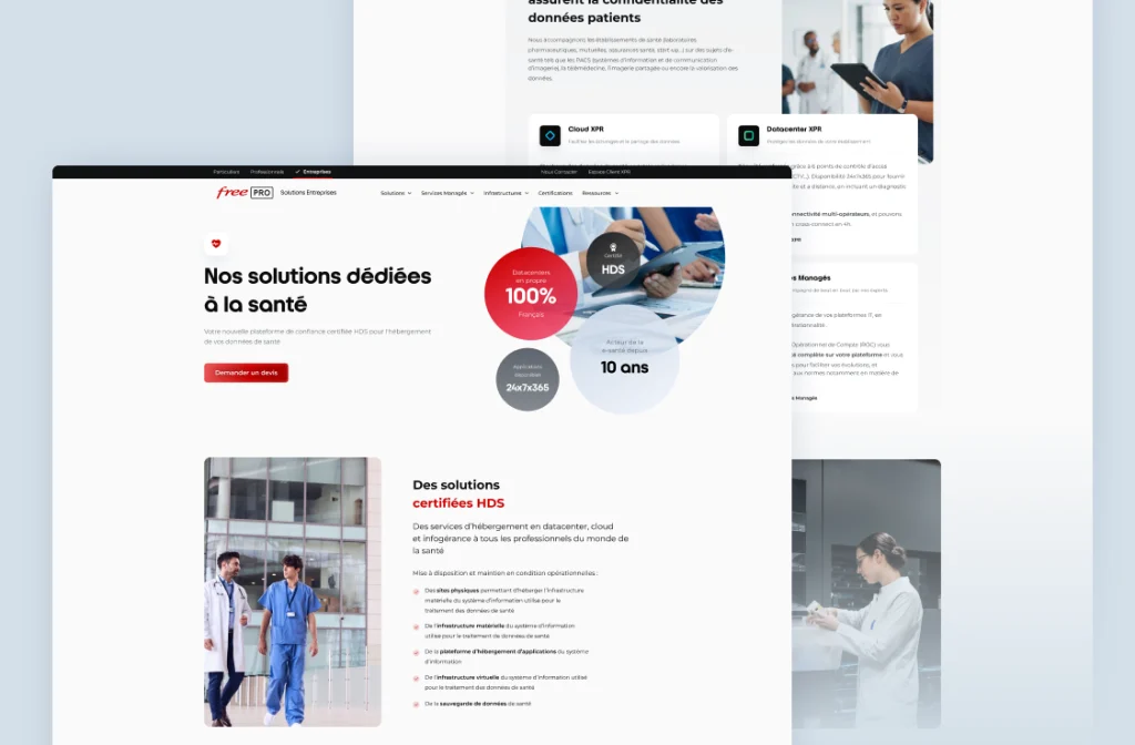
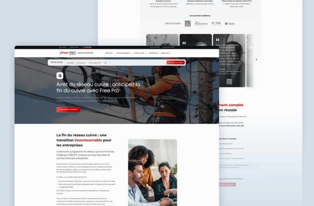
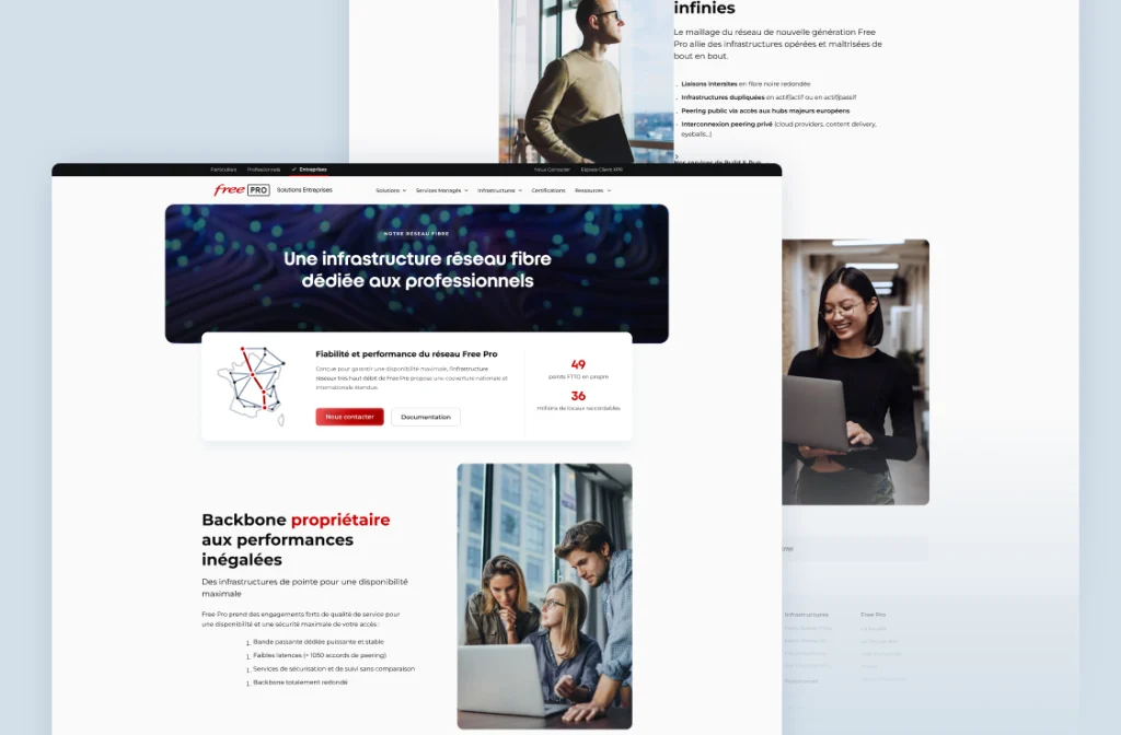
I built the Design System from this new branding. This then allowed me to create the UX/UI mockups and integrate them into the new CMS. The site architecture was rethought and simplified around key pages (Home, Solutions, Infrastructure, Blog, Documentation). Templates were built based on these different page types. Internal linking was redesigned to guide users and generate qualified leads.
Results
Simpler navigation
Identifiable products
Messaging focused on client needs and use cases
For the brand
A website aligned with the Free ecosystem
A strong, recognizable identity
A scalable system for integrating new solutions
For the teams
Time savings
Easier maintenance
An identity adapted across multiple formats
This rebranding project reconciled technical expertise with accessibility, structuring complex solutions within a coherent, scalable system.
The establishment of a clear, structuring visual language laid solid groundwork to support Free Pro's growth in the mid-market and key account segment, while respecting the brand's historical DNA.